A couple of weeks back, I dropped my first album. JK. What I really mean, is that I started my own business under the name IMPRIMO, which is Latin for "to imprint and impress."
In announcing this new business venture, I shared my first work "Hippie Chic at the Beach" through every social media forum possible, and encouraged (aka paid off with ice cream) my family and friends to do the same. Luckily enough, I was able to connect with bride-to-be Katie Kilpatrick with the request of a wedding program.
Katie planned to host her Charleston, SC ceremony outdoors at the B-E-A-UTIFUL Magnolia Plantation & Gardens. Super chic and romantic - I pictured various "The Notebook" scenes as I browsed the site's images. Ryan Gosling=STUD.
Katie was hopeful for the wedding program fan idea, but unsure if it was something that could be fully executed. She sent me several images of sources of inspiration, many of which of were blush pink and gold, very intricately detailed and featuring quaint and classic script.
In completing this project (along with "Hippie Chic at the Beach"), my first order of business is to take into consideration a. Who is the my client? What is his/her personality? and b. What is the event? What vision do they hold for said event? Katie's requests: blush pink, gold, classic, soft, romantic. I took Katie's vision and searched for sources of inspiration.
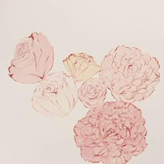
This image caught my attention immediately - I loved the softness of it, and I thought it would fit seamlessly with the whole southern Plantation wedding thing. After having sent Katie the initial proof, she was hesitant, she wanted something a little more in tune with her color scheme so I went back to the drawing board and found this pretty ol' thing.
Katie loved it, as did I. From there it was all manipulating the image, adding effects, matching Katie, the event, the setting, with different texts and hand-drawn details.
It's all about the editing process - I guess you have to be especially OCD and neurotic like myself to handle the fine details of this type of thing. I sent Katie and her sister Sarah several proofs until they were entirely satisfied and gave me the go ahead with production.
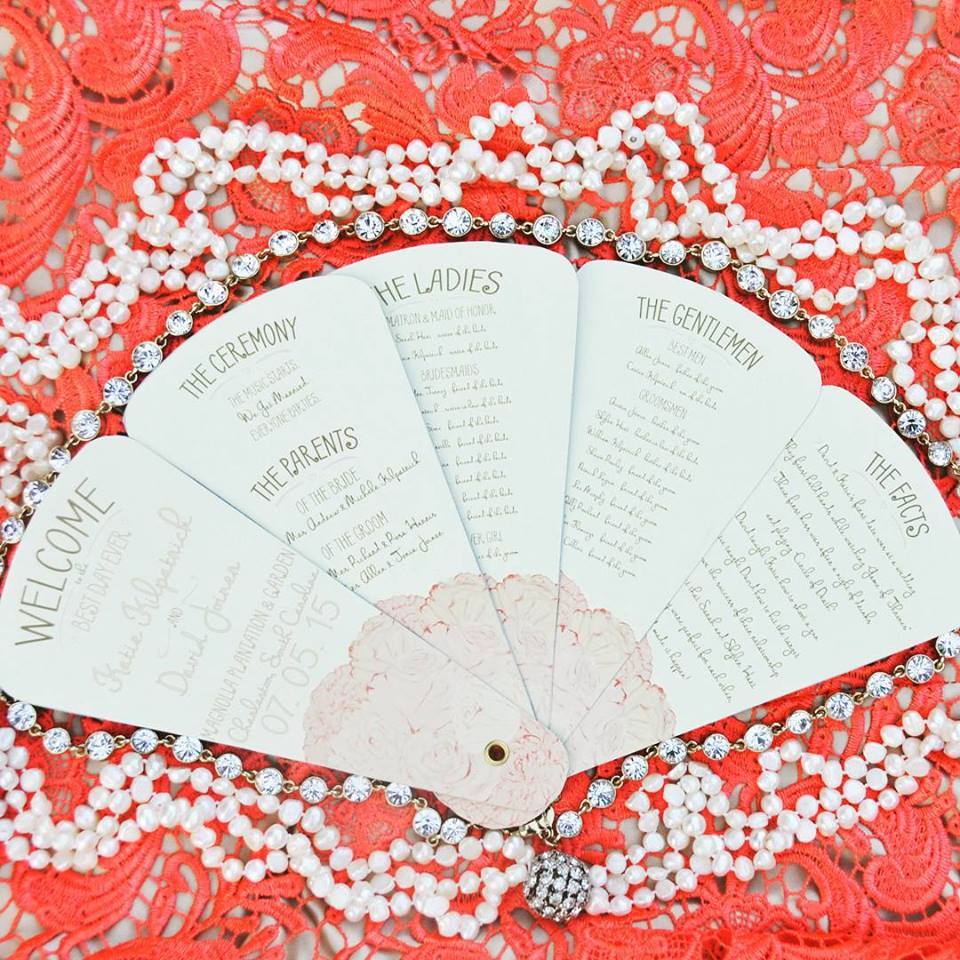
With a lot of work in between, "Katie's Charleston, SC Charmer" came out looking like the beaut that I always thought she'd be.
Oh, and one more...
While the #BLING IS NOT INCLUDED, everything you see here is originally designed and handcrafted by me. My goal in my design and execution is to always be thoughtful of you, your vision, and the end product. I like to think that I achieved in reflecting Katie's vision, and I hope she thinks so too!


